Ice Cream Rare Edition "Ice cream is a frozen dessert usually made from dairy products, such as milk and cream and often combined with fruits or other ingredients and flavours. Most varieties contain sugar, although some are made with other sweeteners."
Yum! I love ice cream, though I probably eat too much of it. It's delicious, probably one of my favorite deserts. =3 Hope you guys enjoy these sweet cards!
nakaimo
Post limit: #18 (#20)
Members/Staff: 1
Participants: any
+ 1 if you tell me your favorite flavor ice cream ~
Nerveri
Members/Staff: 1 +Bonus if you give me feedback/ways I can impurv
Participants: any
Post limit: #18 (#20) Hai guys! I'm relatively new to cardmaking, so these cards may look a little simple.
Don't hate on me too much, you'll kill my self-esteem.Tell me they're beautiful TTATT All Cards! 123Bonus
Name: Zeenipai
Zeenipai
Cards by~
nakaimo: 3 +1 (chocolate xDD)
Nerveri: 1 + bonus (text is a bit too plain, try using different fonts, for example go to dafont.com and find a font that fits with the picture and theme ! but you cut the picture really good ^^ )
Comment: thanks :D
Name: Bryannn
Cards by~
nakaimo: 1+3 [Vanilla <3]
Nerveri: 1
Comment: thank you very much <3
Name: militus
Cards by~
nakaimo: 1, 3
Nerveri: 1 + Bonus (You are very good at card making,great job)
Comment: Icecream!Can you let me help with the delivery please,I like my job ^_^
Well this is pretty hard for me, because your cards are better then mine... but hell I want the bonus so I'll try to give you some usefull...ness XD. So first of all, whoa, they're awesome :3 I think you can experiment a bit with the shape of the cards, yknow round, shapy..trianglish..stuff. Yknow just try some shapes out :3 It'll make your cards look more unique ^^ I guess you can also do a bit more with the backgrounds, number 2 is a bit plain, but I really like the background for the bonus, and card 1. You could also try to experiment a bit with the text and size of it, but well.. since you're (kind of) new to cardmaking I really think these are awesome :D~ (I hope you found this kind of usefull haha :3)
Comment: Thank you guys so much~ :3
Name: nakaimo
Cards by~
Nerveri: 1 2 3
Comment: LOL, forgot I could request. XD Anyway, thanks for the cards, they look great! If I had to give you feedback, I would say maybe pick a color for the text that'll have more contrast on the background. :)
Name: Burley
Cards by~
nakaimo: 2,3 Strawberry :D:D
Nerveri: 3
Thanks for the ice cream xD
Name: mcxynth
Cards by~
nakaimo: 1 + 2, I love cheese-flavored ice cream~! *u*
Nerveri: 1
Comment: These are so sweet~! They also look like Visa Cards~ Ehe~ *U* Arigatou~! xD Nerveri-san, you're good already ya know~! ^_^ Although the only thing I could say is the font~ You could try using a diff. one next time so it would be easily readable~! xD Again, arigatou~! *u*
Name: Nerveri
Cards by~
nakaimo: All (sorry, they look too good!)
Comment: Thank you guys for the feedback^^
Name: Athalon
Cards by~
nakaimo: 1,2 (Vanilla, and also canteloupe by Haagen-Daz *no longer available >.>*)
Nerveri: 1, bonus (well you can try different effects for cards, and different shapes too. Try not to limit your cards to just rectanble, try some polygons. Nevertheless, they look awesome!)
Thx >:D
Signature removed. Please follow the signature rules, as defined in the Site & Forum Guidelines.
Name: AiCon
Cards by~
nakaimo: 2, 3 (Vanilla and Cookie dough chocolate chip)
Nerveri: 1 + Bonus (Your cards right now look really good, but I guess it would look better if it didn't have so much empty space in them. Try centering the character next time.)
Comment: Thank You~
Name: _Noiz_
Cards by~
nakaimo: 1
Nerveri: 3 + Bonus (You could try adding more decoration and lighting so there isn't so much focus on empty space.
Comment: Thank you.
Signature removed. Please follow the signature rules, as defined in the Site & Forum Guidelines.
Name: Yacchi
Cards by~
nakaimo: 1, 2 Ube and Cookies & Cream flavor are my fav
Nerveri: 3+Bonus
You're really good for a newbie. *-* Anyway, you can use two or more different fonts next time and not just only one. You can also try to move the render into the center a little bit.
Name: zoromilk
Cards by~
nakaimo: 2
Nerveri: 3 + bonus (feedback: they look really great!! maybe next time try different shapes, or not having such empty space although i think if the background is a pattern it makes the empty space not so empty. hope i helped!!! ;)
Comment: thanks!!
Name: DoReMinami
Cards by~
nakaimo: 1
Nerveri: 1 + Bonus > Your cards are awesome! And even more so for being new to it :D For improvements, I suggest experimenting with different fonts and the sizes of all the components to keep things proportional and interestingly varied. And always look at your finished product to see if you like everything or if there is something you can make better. The littlest things can make all the difference~ Hope that helps a bit ^^ Keep up the good work! Sorry for the long feedback >< haha
Comment: Great cards~ I love ice cream ♥ Please and thank you! :)
"You've been hanging on all this time, haven't you?"
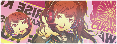
Name: PrincessAhri
Cards by~
nakaimo: 3 & + Bonus: [Vanilla! <3]
Nerveri: 3 + Bonus: [The colors are contrasting really well, but I think the color scheme+background should match. You're not bad for a first timer at making member cards. They look really good though, so keep on improving. '-' Experiment with textures, backgrounds, colors, fonts, etc, and you'll get a hang of it.]
Comment: Wonderful job you two. Thanks~ <3
Name: AoniumSenpai
Cards by~
nakaimo: 1, 3 (My fav is prob Cookies and cream :D)
Nerveri: 1 + Bonus (I like the cards :P Maybe put a more noticeable border?)
Comment: Thanks!!
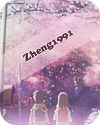
Name: Zheng1991
Cards by~
nakaimo: 1,3 (vanilla)
Nerveri: 1 + bonus ( try use other kinds of background, the background u using kinda common and simple)
Comment: thanks :3


